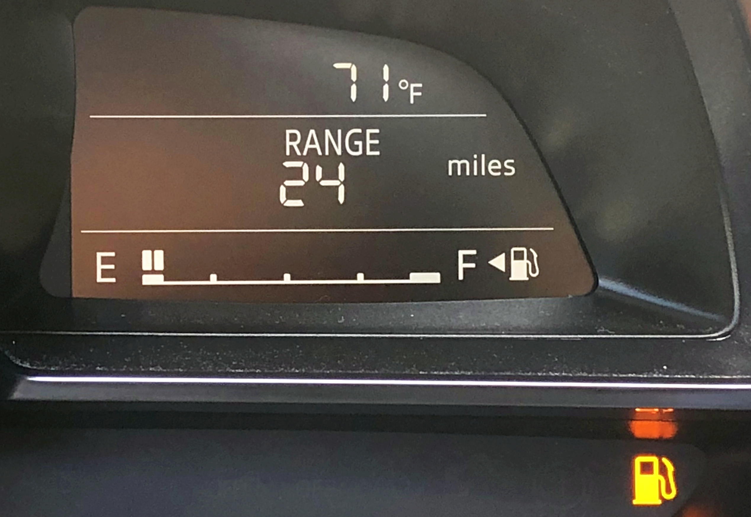
I hadn’t heard of James Moylan until I read a story about him in the Wall Street Journal after he passed away in December, but it turns out my gaze had fallen on one his designs almost every day of my adult life. Moylan was the designer at Ford who came up with the idea of putting an arrow next to the gas tank symbol to indicate which side of the car the tank was on. It’s called the Moylan Arrow in his honor.
The Moylan Arrow put me in mind of another person we lost in 2025, the safety researcher James Reason. If you’ve heard of James Reason, it’s probably because of the Swiss cheese model of accidents that Reason proposed. But Reason made other conceptual contributions to the field of safety, such as organizational accidents and resident pathogens. The contribution that inspired this post was his model of human error described in his book Human Error. The model is technically called the Generic Error-Modeling System (GEMS), but I don’t know if anybody actually refers to it by that name. And the reason GEMS came to mind was because Reason’s model was itself built on top of another researcher’s model of human performance, Jens Rasmussen’s Skills, Rules and Knowledge (SRK) model.
Rasmussen was trying to model how skilled operators perform tasks, how they process information in order to do so, and how user interfaces like control panels could better support their work. He worked at a Danish research lab focused on atomic energy, and his previous work included designing a control room for a Danish nuclear reactor, as well as studying how technicians debugged problems in electronics circuits.
The part of the SRK model that I want to talk about here is the information processing aspect. Rasmussen draws a distinction between three different types of information, which he labels signals, signs, and symbols.
The signal is the most obvious type of visual information to absorb, where there is minimal interpretation required to make sense of the signal. Consider the example of the height of mercury in a thermometer to observe the temperature. There’s a direct mapping between the visual representation of the sensor and the underlying phenomenon in the environment – a higher level of mercury means a hotter temperature.
A sign requires some background knowledge in order to interpret the visual information, but once you have internalized that information, you will be able to very quickly to interpret its meaning sign. Traffic lights are one such example: there’s no direct physical relationship between a red-colored light and the notion of “stop”, it’s an indirect association, mediated by cultural knowledge.
A symbol requires more active cognitive work in order to make sense of. To take an example from my own domain, reading the error logs emitted by a service would be an example of a task that involves visual information processing of symbols. Interpreting log error messages are much more laborious than, say, interpreting a spike in an error rate graph.
(Note: I can’t remember exactly where I got the thermometer and traffic light examples from, but I suspect it was from A Meaning Processing Approach to Cognition by John Flach and Fred Voorhost).
From his paper, Rasmussen describes signals as representing continuous variables. That being said, I propose the Moylan arrow as a great example of a signal, even though the arrow does not represent a continuous variable. Moylan’s arrow doesn’t require background knowledge to learn how to interpret it, because there’s a direct mapping between the direction the triangle is pointing and the location of the gas tank.
Rasmussen maps these three types of information processing to three types of behavior (signals relate to skill-based behavior, signs relate to rule-based behavior, and symbols relate to knowledge-based behavior). James Reason created an error taxonomy based on these different behaviors. In Reason’s terminology, slips and lapses happen at the skill-based level, rule-based mistakes happen at the rule-based level, and knowledge-based mistakes happen at the knowledge-based level.
Rasmussen’s original SRK paper is a classic of the field. Even though it’s forty years old, because the focus is on human performance and information processing, I think it’s even more relevant today than when it was originally published: thanks to open source tools like Grafana and the various observability vendors out there, there are orders of magnitude more operator dashboards being designed today than there were back in the 1980s. While we’ve gotten much better at being able to create dashboards, I don’t think my field has advanced much at being able to create effective dashboards.
