When writing up my impressions of the GCP incident report, Cindy Sridharan’s tweet reminded me that I failed to comment on an important part of it, how the responders brought the overloaded system back to a healthy state.
Full report for yesterday’s Google outage
– not feature flagging a new code path – null pointer crashing a binary when reading empty fields from Spanner – remediation causing a thundering herd as there was no exponential backoff – which required manual throttling to recover from pic.twitter.com/6AQ4BQk5ex
Which brings me to the topic of this post: the “what went well” section of an incident write-up. Generally, public incident write-ups don’t have such sections. This is almost certainly for rational political reasons: it would be, well, gauche to recount to your angry customers about what a great job you did handling the incident. However, internal write-ups often have such sections, and that’s my focus here.
In my experience, “What went well” is typically the shortest section in the entire incident report, with a few brief bullet points that point out some positive aspects of the response (e.g., people responded quickly). It’s a sort of way-to-go!, a way to express some positive feedback to the responders on a job well done. This is understandable, as people believe that if we focus more on what went wrong than what went well, then we are more likely to improve the system, because we are focusing on repairing problems. This is why “what went wrong” and “what can we do to fix it” takes the lion’s share of the attention.
But the problem with this perspective is that it misunderstands the skills that are brought to bear during incident response, and how learning from a previously well-handled incident can actually help other responders do better in future incidents. Effective incident response happens because the responders are skilled. But every incident response team is an ad-hoc one, and just because you happened to have people with the right set of skills responding last time, doesn’t mean you’ll have the people with the right set the next time. This means that if you gloss over what went well, your next incident might be even worse than the last one, because you’ve described those future responders of the opportunity to learn from observing the skilled responders last time.
To make this more concrete, let’s look back at that the GCP incident report. In this scenario, the engineers had put in a red-button as a safety precaution and exercised it to remediate the audience.
As a safety precaution, this code change came with a red-button to turn off that particular policy serving path… Within 2 minutes, our Site Reliability Engineering team was triaging the incident. Within 10 minutes, the root cause was identified and the red-button (to disable the serving path) was being put in place.
However, that’s not the part that interests me so much. Instead, it’s the part about how the infrastructure became overloaded as a consequence of the remediation, and how the responders recovered from overload.
Within some of our larger regions, such as us-central-1, as Service Control tasks restarted, it created a herd effect on the underlying infrastructure it depends on (i.e. that Spanner table), overloading the infrastructure…. It took up to ~2h 40 mins to fully resolve in us-central-1 as we throttled task creation to minimize the impact on the underlying infrastructure and routed traffic to multi-regional databases to reduce the load.
This was not a failure scenario that they had explicitly designed for in advance of deploying the change: there was no red-button they could simply exercise to roll back the system to a non-overloaded state. Instead, they were forced to improvise a solution based on the controls that were available to them. In this case, they were able to reduce the load by turning down the rate of task creation, as well as by re-routing traffic away from the overloaded database.
And this sort of work is the really interesting bit an incident: how skilled responders are able to take advantage of generic functionality that is available in order to remediate an unexpected failure mode. This is one of the topics that the field of resilience engineering focuses on, how incident responders are able to leverage generic capabilities during a crunch. If I was an engineer at Google in this org, I would be very interested to learn what knobs are available and how to twist them. Describing this in detail in an incident write-up will increase my chances of being able to leverage this knowledge later. Heck, even just leaving bread crumbs in the doc will help, because I’ll remember the incident, look up the write-up, and follow the links.
Another enormously useful “what went well” aspect that often gets short shrift is a description of the diagnostic work: how the responders figured out what was going on. This never shows up in public incident write-ups, because the information is too proprietary, so I don’t blame Google for not writing about how the responders determined the source of the overload. But all too often these details are left out of the internal write-ups as well. This sort of diagnostic work is a crucial set of skills for incident response, and having the opportunity to read about how experts applied their skills to solve this problem help transfers these skills across the organization.
Here’s my claim: providing details on how things went well will reduce your future mitigation time even more than focusing on what went wrong. While every incident is different, the generic skills are common, and so getting better at response will get you more mileage than preventing repeats of previous incidents. You’re going to keep having incidents over and over. The best way to get better at incident handling is to handle more incidents yourself. The second best way is to watch experts handle incidents. The better you do at telling the stories of how your incidents were handled, the more people will learn about how to handle incidents.
On Thursday (2025-06-12), Google Cloud Platform (GCP) had an incident that impacted dozens of their services, in all of their regions. They’ve already released an incident report (go read it!), and here are my thoughts and questions as I read it.
Note that the questions I have shouldn’t be explicitly seen as a critique as of the write-up, as the answers to the questions generally aren’t publicly shareable. They’re more in the “I wish I could be a fly on the wall inside of Google” questions.
Quick write-up
First, a meta-point: this is a very quick turnaround for a public incident write-up. As a consumer of these, I of course appreciate getting it faster, and I’m sure there was enormous pressure inside of the company to get a public write-up published as soon as possible. But I also think there are hard limits on how much you can actually learn about an incident when you’re on the clock like this. I assume that Google is continuing to investigate internally how the incident happened, and I hope that they publish another report several weeks from now with any additional details that they are able to share publicly.
Staging land mines across regions
Note that impact (June 12) happened two weeks after deployment (May 29).
This code change and binary release went through our region by region rollout, but the code path that failed was never exercised during this rollout due to needing a policy change that would trigger the code.
The system involved is called Service Control. Google stages their deploys of Service Control by region, which is a good thing: staging your changes is a way of reducing the blast radius if there’s a problem with the code. However, in this case, the problematic code path was not exercised during the regional rollout. Everything looked good in the first region, and so they deployed to the next region, and so on.
This the land mine risk: when the code you are rolling out contains a land mine which is not tripped during the rollout.
How did the decisions make sense at the time?
I have no information about how this incident came to be but I can confidently predict that people will blame it on greedy execs and sloppy devs, regardless of what the actual details are. And they will therefore learn nothing from the details.
The issue with this change was that it did not have appropriate error handling nor was it feature flag protected. Without the appropriate error handling, the null pointer caused the binary to crash.
This is the typical “we didn’t do X in this case and had we done X, this incident wouldn’t have happened, or wouldn’t have been as bad” sort of analysis that is very common in these write-ups. The problem with this is that it implies sloppiness on the part of the engineers, that important work was simply overlooked. We don’t have any sense on how the development decisions made sense at the time.
If this scenario was atypical (i.e., usually error handling and feature flags are added), what was different about this development case? We don’t have the context about what was going on during development, which means we (as external readers) can’t understand how this incident actually was enabled.
Feature flags are used to gradually enable the feature region by region per project, starting with internal projects, to enable us to catch issues. If this had been flag protected, the issue would have been caught in staging.
How do they know it would have been caught in staging, if it didn’t manifest in production until two weeks after roll-out? Are they saying that adding a feature flag would have led to manual testing of the problematic code path in staging? Here I just don’t know enough about Google’s development processes to make sense of this observation.
Service Control did not have the appropriate randomized exponential backoff implemented to avoid [overloading the infrastructure].
As I discuss later, I’d wager it’s difficult to test for this in general, because the system generally doesn’t run in the mode that would exercise this. But I don’t have the context, so it’s just a guess. What’s the history behind Service Control’s backoff behavior? By definition, Without knowing its history, we can’t really understand how its backoff implementation came to be this way.
Red buttons and feature flags
As a safety precaution, this code change came with a red-button to turn off that particular policy serving path. The issue with this change was that it did not have appropriate error handling nor was it feature flag protected. (emphasis added)
Because I’m unfamiliar with Google’s internals, I don’t understand how their “red button” system works. In my experience, the “red button” type functionality is built on top of feature flag functionality, but that does not seem to be the case at Google, since here there was no feature flag, but there was a big red button.
It’s also interesting to me that, while this feature wasn’t feature-flagged it was big-red-buttoned. There’s a story here! But I don’t know what it is.
New feature: additional policy quota checks
On May 29, 2025, a new feature was added to Service Control for additional quota policy checks… On June 12, 2025 at ~10:45am PDT, a policy change was inserted into the regional Spanner tables that Service Control uses for policies.
I have so many questions.. What were these additional quota policy checks? What was the motivation for adding these checks (i.e., what problem are the new checks addressing)? Is this customer-facing functionality (e.g., GCP Cloud Quotas), or is this an internal-only? What was the purpose of the policy change that was inserted on June 12 (or was it submitted by a customer)? Did that policy change take advantage of the new Service Control features that were added on May 29? Was that the first policy change that happened since the new feature was deployed, or had there been others? How frequently do policy changes happen?
Global data changes
Code changes are scary, config changes are scarier, and data changes are the scariest of them all.
Given the global nature of quota management, this metadata was replicated globally within seconds.
While code and feature flag changes are staged across regions, apparently quota management metadata is designed to replicate globally.
Regardless of the business need for near instantaneous consistency of the data globally (i.e. quota management settings are global), data replication needs to be propagated incrementally with sufficient time to validate and detect issues. (emphasis mine)
The implication I take from from the text was that there was a business requirement for quota management data changes to happen globally rather than staged, and that they are now going to push back on that.
What was the rationale for this business requirement? What are the tradeoffs involved in staging these changes versus having them happen globally? What new problems might arise when data changes are staged like this?
Are we going to be reading a GCP incident report in a few years that resulted from inconsistency of this data across regions due to this change?
Saturation!
From an operational perspective, I remain terrified of databases
Within some of our larger regions, such as us-central-1, as Service Control tasks restarted, it created a herd effect on the underlying infrastructure it depends on (i.e. that Spanner table), overloading the infrastructure.
Here we have a classic example of saturation, where a database got overloaded. Note that saturation wasn’t the trigger here, but it made recovery more difficult. Our system is in a different mode during incident recovery than it is during normal mode, and it’s generally very difficult to test for how it will behave when it’s in recovery mode.
Does this incident match my conjecture?
I have a long-standing conjecture that once a system reaches a certain level of reliability, most major incidents will involve:
A manual intervention that was intended to mitigate a minor incident, or
Unexpected behavior of a subsystem whose primary purpose was to improve reliability
I don’t have enough information in this write-up to be able to make a judgment in this case: it depends on whether or not the quota management system’s purpose is to improve reliability. I can imagine it going either way. If it’s a public-facing system to help customers limit their costs, then that’s more of a traditional feature. On the other hand, if it’s to limit the blast radius of individual user activity, then that feels like a reliability improvement system.
What are the tradeoffs of the corrective actions?
The write-up lists seven bullets of corrective actions. The questions I always have of corrective actions are:
What are the tradeoffs involved in implementing these corrective actions?
How might they enable new failure modes or make future incidents more difficult to deal with?
A year ago, Mihail Eric wrote a blog post detailing his experiences working on AI inside Amazon: How Alexa Dropped the Ball on Being the Top Conversational System on the Planet. It’s a great first-person account, with lots of detail of the issues that kept Amazon from keeping up with its peers in the LLM space. From my perspective, Eric’s post makes a great case study in what resilience engineering researchers refer to as brittleness, which is a term that the researchers use to refer to as a kind of opposite of resilience.
In the paper Basic Patterns in How Adaptive Systems Fail, the researchers David Woods and Matthieu Branlat note that brittle systems tend to suffer from the following three patterns:
Decompensation: exhausting capacity to adapt as challenges cascade
Working at cross-purposes: behavior that is locally adaptive but globally maladaptive
Getting stuck in outdated behaviors: the world changes but the system remains stuck in what were previously adaptive strategies (over-relying on past successes)
Eric’s post demonstrates how all three of these patterns were evident within Amazon.
Decompensation
It would take weeks to get access to any internal data for analysis or experiments… Experiments had to be run in resource-limited compute environments. Imagine trying to train a transformer model when all you can get a hold of is CPUs. Unacceptable for a company sitting on one of the largest collections of accelerated hardware in the world.
If you’ve ever seen a service fall over after receiving a spike in external requests, you’ve seen a decompensation system failure. This happens when a system isn’t able to keep up with the demands that are placed upon on it.
In organizations, you can see the decompensation failure pattern emerge when decision-making is very hierarchical: you end up having to wait for the decision request to make its way up to someone who has the authority to make the decision, and then make its way down again. In the meantime, the world isn’t standing still waiting for that decision to be made.
As described in the Bad Technical Process section of Eric’s post, Amazon was not able to keep up with the rate at which its competitors were making progress on developing AI technology, even though Amazon had both the talent and the compute resources necessary in order to make progress. The people inside the organization who needed the resources weren’t able to get them in a timely fashion. That slowed down AI development and, consequently, they got lapped by their competitors.
Working at cross-purposes
Alexa’s org structure was decentralized by design meaning there were multiple small teams working on sometimes identical problems across geographic locales.
This introduced an almost Darwinian flavor to org dynamics where teams scrambled to get their work done to avoid getting reorged and subsumed into a competing team.
The consequence was an organization plagued by antagonistic mid-managers that had little interest in collaborating for the greater good of Alexa and only wanted to preserve their own fiefdoms.
My group by design was intended to span projects, whereby we found teams that aligned with our research/product interests and urged them to collaborate on ambitious efforts. The resistance and lack of action we encountered was soul-crushing.
Where decompensation is a consequence of poor centralization, working at cross-purposes is a consequence of poor decentralization. In a decentralized organization, the individual units are able to work more quickly, but there’s a risk of alignment: enabling everyone to row faster isn’t going to help if they’re rowing in different directions.
In the Fragmented Org Structures section of Eric’s writeup, he goes into vivid, almost painful detail about how Amazon’s decentralized org structure worked against them.
Getting stuck in outdated behaviors
Alexa was viciously customer-focused which I believe is admirable and a principle every company should practice. Within Alexa, this meant that every engineering and science effort had to be aligned to some downstream product.
That did introduce tension for our team because we were supposed to be taking experimental bets for the platform’s future. These bets couldn’t be baked into product without hacks or shortcuts in the typical quarter as was the expectation.
So we had to constantly justify our existence to senior leadership and massage our projects with metrics that could be seen as more customer-facing.
…
This introduced product/science conflict in every weekly meeting to track the project’s progress leading to manager churn every few months and an eventual sunsetting of the effort.
I’m generally not a fan of management books, but What got you here won’t get you there is a pretty good summary of the third failure pattern: when organizations continue to apply approaches that were well-suited to problems in the past but are ill-suited to problems in the present.
In the Product-Science Misalignment section of his post, Eric describes how Amazon’s traditional viciouslycustomer-focused approach to development was a poor match for the research-style work that was required for developing AI. Rather than Amazon changing the way they worked in order to facilitate the activities of AI researchers, the researchers had to try to fit themselves into Amazon’s pre-existing product model. Ultimately, that effort failed.
I write mostly about software incidents on this blog, which are high-tempo affairs. But the failure of Amazon to compete effectively in the AI space, despite its head start with Alexa, its internal talent, and its massive set of compute resources, can also be viewed as a kind of incident. As demonstrated in this post, we can observe the same sorts of patterns in failures that occur in the span of months as we can in failures that occur in the span of minutes. How well Amazon is able to learn from this incident remains to be seen.
How do experts make decisions? One theory is that they generate a set of options, estimate the cost and benefits of each option, and then choose the optimal one. The psychology researcher Gary Klein developed a very different theory of expert decision-making, based on his studies of expert decision-making in domains such as firefighting, nuclear power plant operations, aviation, anesthesiology, nursing, and the military. Under Klein’s theory of naturalistic decision-making, experts use a pattern-matching approach to make decisions.
Even before Klein’s work, humans are already known to be quite good at pattern recognition. We’re so good at spotting faces that we have a tendency to see things as faces that aren’t actually faces, a phenomenon known as pareidolia.
(Wout Mager/Flickr/CC BY-NC-SA 2.0)
As far as I’m aware, Klein used the humans-as-black-boxes research approach of observing and talking to the domain experts: while he was metaphorically trying to peer inside their heads, he wasn’t doing any direct measurement or modeling of their brains. But if you are inclined to take a neurophysiological view of human cognition, you can see how the architecture of the brain provides a mechanism for doing pattern recognition. We know that the brain is organized as an enormous network of neurons, which communicate with each other through electrical impulses.
The psychology researcher Frank Rosenblatt is generally credited with being the first researcher to do computer simulations of a model of neural networks, in order to study how the brain works. He called his model a perceptron. In his paper The Perceptron: a probabilistic model for information storage and organization in the brain, he noted pattern recognition as one of the capabilities of the perceptron.
While perceptrons may have started out as a model for psychology research, they became one of a competing set of strategies for building artificial intelligence systems. The perceptron approach to AI was dealt a significant blow by the AI researchers Marvin Minsky and Seymour Papert in 1969 with the publication of their book Perceptrons. Minsky and Papert demonstrated that there were certain cognitive tasks that perceptrons were not capable of performing.
However, Minsky and Papert’s critique applied to only single-layer perceptron networks. It turns out that if you create a network out of multiple layers, and you add non-linear processing elements to the layers, then these limits to the capabilities of a perceptron no longer apply. When I took a graduate-level artificial neural networks course back in the mid 2000s, the networks we worked with had on the order of three layers. Modern LLMs have a lot more layers than that: the deep in deep learning refers to the large number of layers. For example, the largest GPT-3 model (from OpenAI) has 96 layers, the larger DeepSeek-LLM model (from DeepSeek) has 95 layers, and the largest Llama 3.1 model (from Meta) has 126 layers.
Here’s a ridiculously oversimplified conceptual block diagram of a modern LLM.
There’s an initial stage which takes text and turns it into a sequence of vectors. Then, those sequence of vectors get passed through the layers in the middle. Finally, you get your answer out at the end. (Note: I’m deliberately omitting discussion about what actually happens in the stages depicted by the oval and the diamond above, because I want to focus here on the layers in the middle for this post. I’m not going to talk at all about concepts like tokens, embedding, attention blocks, and so on. If you’re interested in these sorts of details, I highly recommend the video But what is a GPT? Visual intro to Transformers by Grant Sanderson).
We can imagine the LLM as a system that recognizes patterns at different levels of abstraction. The first and last layers deal directly with representations of words, so they have to operate at the word level of abstraction, let’s think of that as the lowest layer. As we go deeper into the network initially, we can imagine each layer as dealing with patterns at a higher level of abstraction, we could call them concepts. Since the last layer deals with words again, layers towards the end would be at a lower layer of abstraction.
But, really, this talk of encoding patterns at increasing and decreasing levels of abstraction is all pure speculation on my part, there’s no empirical basis to this. In reality, we have no idea what sorts of patterns are encoded in the middle layers. Do they correspond to what we humans think of as concepts? We simply have no idea how to interpret the meaning of the vectors that are generated by the intermediate layers. Are the middle layers “higher level” than the outer layers in the sense that we understand that term? Who knows? We just know that we get good results.
The things we call models have different kinds of applications. We tend to think first of scientific models, which are models that give scientists insight into how the world works. Scientific models are a type of model, but not the only one. There are also engineering models, whose purpose is to accomplish some sort of task. A good example of an engineering model is a weather prediction model that tells us what the weather will be like this week. Another good example of an engineering model is SPICE, which electrical engineers use to simulate electronic circuits.
Perceptrons started out as a scientific model of the brain, but their real success has been as an engineering model. Modern LLMs contain within them feedforward neural networks, which are the intellectual descendants of Rosenblatt’s perceptrons. Some people even refer to these as multilayer perceptrons. But LLMs are not an engineering model that was designed to achieve a specific task, the way that weather models or circuits models do. Instead, these are models that were designed to predict the next word in a sentence, and it just so happens that if you build and train your model the right way, you can use it to perform cognitive tasks that it was not explicitly designed to do! Or, as Sean Goedecke put it in a recent blog post (emphasis mine)
Transformers work because (as it turns out) the structure of human language contains a functional model of the world. If you train a system to predict the next word in a sentence, you therefore get a system that “understands” how the world works at a surprisingly high level. All kinds of exciting capabilities fall out of that – long-term planning, human-like conversation, tool use, programming, and so on.
This is a deeply weird and surprising outcome about building a text prediction system. We’ve built text prediction systems before. Claude Shannon was writing about probability-based models of natural language back in the 1940s in his famous paper that gave birth to the field of information theory. But it’s not obvious that once these models got big enough, we’d get results like we’re getting today, where you could ask the model questions and get answers. At least, it’s not obvious to me.
In 2020, the linguistics researchers Emily Bender and Alexander Koller published a paper titled Climbing towards NLU: On Meaning, Form, and Understanding in the Age of Data. This is sometimes known as the octopus paper, because it contains a thought experiment about a hyper-intelligent octopus eavesdropping on a conversation between two English speakers by tapping into an undersea telecommunications cable, and how the octopus could never learn the meaning of English phrases through mere exposure. This seems to contradict Goedecke’s observation. They also note how research has demonstrated that humans are not capable of learning a new language through mere exposure to it (e.g., through TV or radio). But I think the primary thing this illustrates is how fundamentally different LLMs are from human brains, and how little we can learn about LLMs by making comparisons to humans. The architecture of an LLM is radically different from the architecture of a human brain, and the learning processes are also radically different. I don’t think a human could learn the structure of a new language by being exposed to a massive corpus and then trying to predict the next word. Our intuitions, which work well when dealing with humans, simply break down when we try to apply them to LLMs.
The late philosopher of mind Daniel Dennett proposed the concept of the intentional stance, as a perspective we take for predicting the behavior of things that we consider to be rational agents. To illustrate it, let’s contrast it with two other stances he mentions, the physical stance and the design stance. Consider the following three different scenarios, where you’re asked to make a prediction.
Scenario 1: Imagine that a child has rolled a ball up a long ramp which is at a 30 degree incline. I tell you that the ball is currently rolling up the ramp at 10 metres / second and ask you to predict what its speed will be one minute from now.
A ball that has been rolled up a ramp
Scenario 2: Imagine a car is driving up a hill at a 10 degree incline. I tell you that the car is currently moving at a speed of 60 km/h, and that the driver has cruise control enabled, also set at 60 km/h. I ask you to predict the speed of the car one minute from now.
A car with cruise control enabled, driving uphill
Scenario 3: Imagine another car on a flat road that going at 50 km/h, and is about to enter an intersection, and the traffic light has just turned yellow. Another bit of information I give you: the driver is heading to an important job interview and is running late. Again, I ask you to predict the speed of the car one minute from now.
In the first scenario (ball rolling up a ramp), we can predict the ball’s future speed by treating it as a physics problem. This is what Dennett calls the physical stance.
In the second scenario (car with cruise control enabled), we view the car as an artifact that was designed to maintain its speed when cruise control is enabled. We can easily predict that its future speed will be 60 km/h. This is what Dennett calls the design stance. Here, we are using our knowledge that the car has been designed to behave in certain ways in order to predict how it will behave.
In the third scenario (driver running late who encounters a yellow light), we think about the intentions of the driver: they don’t want to be late for their interview, so we predict that they will accelerate through the intersection. We predict that the driver will accelerate through the intersection, and so we predict their future speed will be somewhere around 60 km/h. This is what Dennett calls the intentional stance. Here, we are using our knowledge of the desires and beliefs of the driver to predict what actions they will take.
Now, because LLMs have been designed to replicate human language, our instinct is to apply to the intentional stance to predict their behavior. It’s a kind of pareidolia, we’re seeing intentionality in a system that mimics human language output. Dennett was horrified by this.
But the design stance doesn’t really help us either, with LLMs. Yes, the design stance enables us to predict that an LLM-based chatbot will generate plausible-sounding answers to our questions, because that is what it was designed to do. But, beyond that, we can’t really reason about its behavior.
Generally, operational surprises are useful in teaching us how our system works by letting us observe circumstances in which it is pushed beyond its limits. For example, we might learn about a hidden limit somewhere in the system that we didn’t know about before. This is one of the advantages of doing incident reviews, and it’s also one of the reasons that psychologists study optical illusions. As Herb Simon put it in The Sciences of the Artificial,Only when [a bridge] has been overloaded do we learn the physical properties of the materials from which it is built.
However, when an LLM fails from our point of view by producing a plausible but incorrect answer to a question, this failure mode doesn’t give us any additional insight into how the LLM actually works. Because, in a real sense, that LLM is still successfully performing the task that it was designed to do: generate plausible-sounding answers. We aren’t capable of designing LLMs that only produce correct answers, we can only do plausible ones. And so we learn nothing about what we consider LLM failures, because the LLMs aren’t actually failing. They are doing exactly what they are designed to do.
Simplicity is prerequisite for reliability. — Edsger W. Dijkstra
Think about a system whose reliability had significantly improved over some period of time. The first example that comes to my mind is commercial aviation, but I’d encourage you to think of a software system you’re familiar with, either as a user (e.g., Google, AWS) or as a maintainer of a system that’s gotten more reliable over time.
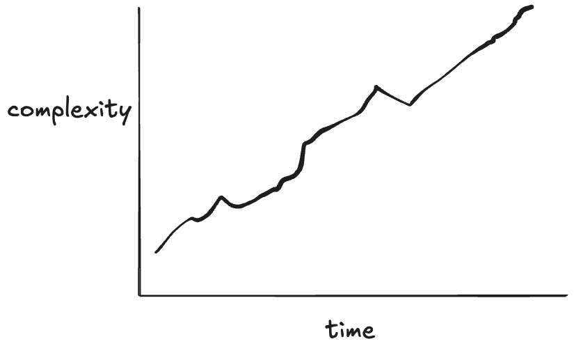
Think of a system where the reliability trend looks like this
Now, for the system you have thought about where its reliability increased over time, think about what the complexity trend looks like over time for that system. I’d wager you’d see a similar sort of trend.
My claim about what the complexity trend looks like over time
Now, in general, increases in complexity don’t lead to increases in reliability. In some cases, engineers make a deliberate decision to trade off reliability for new capabilities. The telephone system today is much less reliable than it was when I was younger. As someone who grew up in the 80s and 90s, the phone system was so reliable that it was shocking to pick up the phone and not hear a dial tone. We were more likely to experience a power failure than a telephony outage, and the phones still worked when the power was out! I don’t think we even knew the term “dropped call”. Connectivity issues with cell phones are much more common than they ever were with landlines. But this was a deliberate tradeoff: we gave up some reliability in order to have ubiquitous access to a phone.
Other times, the increase in complexity isn’t the product of an explicit tradeoff but rather an entropy-like effect of a system getting more difficult to deal with over time as it accretes changes. This scenario, the one that most people have in mind when they think about increasing complexity in their system, is synonymous with the idea of tech debt. With tech debt the increase in complexity makes the system less reliable, because the risk of making a breaking change in the system has increased. I started this blog post with a quote from Dijkstra about simplicity. Here’s another one, along the same lines, from C.A.R. Hoare’s Turing Award Lecture in 1980:
There are two ways of constructing a software design: One way is to make it so simple that there are obviously no deficiencies, and the other way is to make it so complicated that there are no obvious deficiencies. The first method is far more difficult.
What Dijkstra and Hoare are saying is: the easier a software system is to reason about, the more likely it is to be correct. And this is true: when you’re writing a program, the simpler the program is, the more likely that you are to get it right. However, as we scale up from individual programs to systems, this principle breaks down. Let’s see how that happens.
Djikstra claims simplicity is a prerequisite for reliability. According to Dijkstra, if we encounter a system that’s reliable, it must be a simple system, because simplicity is required to achieve reliability.
reliability ⇒ simplicity
The claim I’m making in this post is the exact opposite: systems that improve in reliability do so by adding features that improves reliability, but come at the cost of increased complexity.
reliability ⇒ complexity
Look at classic works on improving the reliability of real-world systems like Michael Nygard’s Release It!, Joe Armstrong’s Making reliable distributed systems in the presence of software errors, and Jim Gray’s Why Do Computers Stop and What Can Be Done About It? and think about the work that we do to make our software systems more reliable, functionality like retries, timeouts, sharding, failovers, rate limiting, back pressure, load shedding, autoscaling, circuit breakers, transactions, and auxiliary systems we have to support our reliability work like an observability stack. All of this stuff adds complexity.
Imagine if I took a working codebase and proposed deleting all of the lines of code that are involved in error handling. I’m very confident that this deletion of code would make the codebase simpler. There’s a reason that programming books tend to avoid error handling cases in their examples, they do increase complexity! But if you were maintaining a reliable software system, I don’t think you’d be happy with me if I submitted a pull request that deleted all of the error handling code.
Let’s look at the natural world, where biology provides us with endless examples of reliable systems. Evolution has designed survival machines that just keep on going; they can heal themselves in simply marvelous ways. We humans haven’t yet figured out how to design systems which can recover from the variety of problems that a living organism can. Simple, though, they are not. They are astonishingly, mind-boggling-y complex. Organisms are the paradigmatic example of complex adaptive systems. However complex you think biology is, it’s actually even more complex than that. Mother nature doesn’t care that humans struggle to understand her design work.
Now, I’m not arguing that this reliability-that-adds-complexity is a good thing. In fact, I’m the first person who will point out that this complexity in service of reliability creates novel risks by enabling new failure modes. What I’m arguing instead is that achieving reliability by pursuing simplicity is a mirage. Yes, we should pay down tech debt and simplify our systems by reducing accidental complexity: there are gains in reliability to be had through this simplifying work. But I’m also arguing that successful systems are always going to get more complex over time, and some of that complexity is due to work that improves reliability. Successful reliable systems are going to inevitably get more complex. Our job isn’t to reduce that complexity, it’s to get better at dealing with it.
“No man ever steps in the same river twice. For it’s not the same river and he’s not the same man” – attributed to Heraclitus
After an incident happens, many people within the organization are worried about the same incident happening again. In one sense, the same incident can never really happen again, because the organization has changed since the incident has happened. Incident responders will almost certainly be more effective at dealing with a failure mode they’ve encountered recently than one they’re hitting for the first time.
In fairness, if the database falls over again, saying, “well, actually, it’s not the same incident as last time because we now have experience with the database falling over so we were able to recover more quickly” isn’t very reassuring to the organization. People are worried that there’s an imminent risk that remains unaddressed, and saying “it’s not the same incident as last time” doesn’t alleviate the concern that the risk has not been dealt with.
But I think that people tend to look at the wrong level of abstraction when they talk about addressing risks that were revealed by the last incident. They suffer from what I’ll call no-more-snow-goon-ism:
Calvin is focused on ensuring the last incident doesn’t happen again
Saturation is an example of a higher-level pattern that I never hear people talk about when focusing on eliminating incident recurrence. I will assert that saturation is an extremely common pattern in incidents: I’ve brought it up when writing about public incident writeups at Canva, Slack, OpenAI, Cloudflare, Uber, and Rogers. The reason you won’t hear people discuss saturation is because they are generally too focused on the specific saturation details of the last incident. But because there are so many resources you can run out of, there are many different possible saturation failure modes. You can exhaust CPU, memory, disk, threadpools, bandwidth, you can hit rate limits, you can even breach limits that you didn’t know existed and that aren’t exposed as metrics. It’s amazing how much different stuff there is that you can run out of.
My personal favorite pattern is unexpected behavior of a subsystem whose primary purpose was to improve reliability, and it’s one of the reasons I’m so bear-ish about the emphasis on corrective actions in incident reviews, but there are many other patterns you can identify. If you hit an expired certificate, you may think of “expired certificate” as the problem, but time-based behavior change is a more general pattern for that failure mode. And, of course, there’s the ever-present production pressure.
If you focus too narrowly on preventing the specific details of the last incident, you’ll fail to identify the more general patterns that will enable your future incidents. Under this narrow lens, all of your incidents will look like either recurrences of previous incidents (“the database fell over again!”) or will look like a completely novel and unrelated failure mode (“we hit an invisible rate limit with a vendor service!”). Without seeing the higher level patterns, you won’t understand how those very different looking incidents are actually more similar than you think.
Why do we retrospect on our incidents? Why spend the time doing those write-ups and holding review meetings? We don’t do this work as some sort of intellectual exercise for amusement. Rather, we believe that if we spend the time to understand how the incident happened, we can use that insight to improve the system in general, and availability in particular. We improve availability by preventing incidents as well as reducing the impact of incidents that we are unable to prevent. This post-incident work should help us do both.
The typical approach to post-incident work is to do a root cause analysis (RCA). The idea of an RCA is to go beyond the surface-level symptoms to identify and address the underlying problems revealed by the incident. After all, it’s only by getting at the root at the problem that we will be able to permanently address it. When doing an RCA, when we attach the label root cause to something, we’re making a specific claim. That claim is: we should focus our attention on the issues that we’ve labeled “root cause”, because spending our time addressing these root causes will yield the largest improvements to future availability. Sure, it may be that there were a number of different factors involved in the incident, but we should focus on the root cause (or, sometimes, a small number of root causes), because those are the ones that really matter. Sure, the fact that Joe happened to be on PTO that day, and he’s normally the one that spots these sorts of these problems early, that’s interesting, but it isn’t the real root cause.
Remember that an RCA, like all post-incident work, is supposed to be about improving future outcomes. As a consequence, a claim about root cause is really a prediction about future incidents. It says that of all of the contributing factors to an incident, we are able to predict which factor is most likely to lead to an incident in the future. That’s quite a claim to make!
Here’s the thing, though. As our history of incidents teaches us over and over again, we aren’t able to predict how future incidents will happen. Sure, we can always tell a compelling story of why an incident happened, through the benefit of hindsight. But that somehow never translates into predictive power: we’re never able to tell a story about the next incident the way we can about the last one. After all, if we were as good at prediction as we are at hindsight, we wouldn’t have had that incident in the first place!
A good incident retrospective can reveal a surprisingly large number of different factors that contributed to the incident, providing signals for many different kinds of risks. So here’s my claim: there’s no way to know which of those factors is going to bite you next. You simply don’t possess a priori knowledge about which factors you should pay more attention to at the time of the incident retrospective, no matter what the vibes tell you. Zeroing in on a small number of factors will blind you to the role that the other factors might play in future incidents. Today’s “X wasn’t the root cause of incident A” could easily be tomorrow’s “X was the root cause of incident B”. Since you can’t predict which factors will play the most significant roles in future incidents, it’s best to cast as wide a net as possible. The more you identify, the more context you’ll have about the possible risks. Heck, maybe something that only played a minor role in this incident will be the trigger in the next one! There’s no way to know.
Even if you’re convinced that you can identify the real root cause of the last incident, it doesn’t actually matter. The last incident already happened, there’s no way to prevent it. What’s important is not the last incident, but the next one: we’re looking at the past only as a guide to help us improve in the future. And while I think incidents are inherently unpredictable, here’s a prediction I’m comfortable making: your next incident is going to be a surprise, just like your last one was, and the one before that. Don’t fool yourself into thinking otherwise.
Here’s a stylized model of work processes and outcomes. I’m going to call it “Model I”.
Model I: Work process and outcomes
If you do work the right way, that is, follow the proper processes, then good things will happen. And, when we don’t, bad things happen. I work in the software world, so by “badoutcome” a mean an incident, and by “doing the right thing”, the work processes typically refer to software validation activities, such as reviewing pull requests, writing unit tests, manually testing in a staging environment. But it also includes work like adding checks in the code for unexpected inputs, ensuring you have an alert defined to catch problems, having someone else watching over your shoulder when you’re making a risky operational change, not deploying your production changes on a Friday, and so on. Do this stuff, and bad things won’t happen. Don’t do this stuff, and bad things will.
If you push someone who believes in this model, you can get them to concede that sometimes nothing bad happens even though someone didn’t do everything can quite right, the amended model looks like this:
Inevitably, an incident happens. At that point, we focus the post-incident efforts on identifying what went wrong with the work. What was the thing that was done wrong? Sometimes, this is individuals who weren’t following the process (deployed on a Friday afternoon!). Other times, the outcome of the incident investigation is a change in our work processes, because the incident has revealed a gap between “doing the right thing” and “our standard work processes”, so we adjust our work processes to close the gap. For example, maybe we now add an additional level of review and approval for certain types of changes.
Here’s an alternative stylized model of work processes and outcomes. I’m going to call it “Model II”.
Model II: work processes and outcomes
Like our first model, this second model contains two categories of work processes. But the categories here are different. They are:
What people are officially supposed to
What people actually do
The first categorization is an idealized view of how the organization thinks that people should do their work. But people don’t actually do their work their way. The second category captures what the real work actually is.
This second model of work and outcomes has been embraced by a number of safety researchers. I deliberately called my models as Model I and Model II as a reference to Safety-I and Safety-II. Safety-II is a concept developed by the resilience engineering researcher Dr. Erik Hollnagel. The human factor experts Dr. Todd Conklin and Bob Edwards describe this alternate model using a black-line/blue-line diagram. Dr. Steven Shorrock refers to the first category as work-as-prescribed, and the second category as work-as-done. In our stylized model, all outcomes come from this second category of work, because it’s the only one that captures the actual work that leads to any of the outcomes. (In Shorrock’s more accurate model, the two categories of work overlap, but bear with me here).
This model makes some very different assumptions about the nature of how incidents happen! In particular, it leads to very different sorts of questions.
The first model is more popular because it’s more intuitive: when bad things happen, it’s because we did things the wrong way, and that’s when we look back in hindsight to identify what those wrong ways were. The second model requires us to think more about the more common case when incidents don’t happen. After all, we measure our availability in 9s, which means the overwhelming majority of the time, bad outcomes aren’t happening. Hence, Hollnagel encourages us to spend more time examining the common case of things going right.
Because our second model assumes that what people actually do usually leads to good outcomes, it will lead to different sorts of questions after an incident, such as:
What does normal work look like?
How is it that this normal work typically leads to successful outcomes?
What was different in this case (the incident) compared to typical cases?
Note that this second model doesn’t imply that we should always just keep doing things the same way we always do. But it does imply that we should be humble in enforcing changes to the way work is done, because the way that work is done today actually leads to good outcomes most of the time. If you don’t understand how things normally work well, you won’t see how your intervention might make things worse. Just because your last incident was triggered by a Friday deploy doesn’t mean that banning Friday deploys will lead to better outcomes. You might actually end up making things worse.
One of the most famous physics experiments in modern history is the double-split experiment, originally performed by the English physicist Thomas Young back in 1801. You probably learned about this experiment in a high school physics class. There was a long debate in physics about whether light was a particle or a wave, and Young’s experiment provided support for the wave theory. (Today, we recognize that light has a dual nature, with both particle-like and wave-like behaviors).
To run the experiment, you need an opaque board that has two slits cut out of it, as well as a screen. You shine a light at the board and look to see what the pattern of light looks like on the screen behind it.
Here’s a diagram from Wikipedia, which shows the experiment being run with electrons rather than light , but is otherwise the same idea.
If light was a particle, then you would expect each light particle to pass through either one slit, or the other. The intensities that you’d observe on the screen would look like the sum of the intensities if you ran the experiment by covering up one slit, and then ran it again by covering up the other slit. It should basically look like the sum of two Gaussian distributions with different means.
However, that isn’t what you actually see on the screen. Instead, you get this pattern where there are some areas of the screen with no intensity at all: where the light never strikes the screen. On the other hand, if you run the experiment by covering up either slit, you will get light at these null locations. This shows that there’s an interference effect, the fact that there are two slits leads the light to behave differently from being the sum of the effects of each slit.
Note that we see the same behavior with electrons (hence the diagram above). Both electrons and light (photons) exhibit this sort of wavelike behavior. This behavior is observed even even if you shine only one electron (or photon) at a time through the slits.
Now, imagine a physicist in the 1970s hires a technician to run this experiment with electrons. The physicist asks the tech to fire one electron at a time from an electron gun at the double-slit board, and record the intensities of the electrons striking a phosphor screen, like on a cathode ray tube (kids, ask your parents about TVs in the old days). Imagine that the physicist doesn’t tell the technicians anything about the theory being tested, the technician is just asked to record the measurements.
Let’s imagine this thought process from the technician:
It’s a lot of work to record the measurements from the phosphor screen, and all of this intensity data is pretty noisy anyways. Instead, why don’t I just identify the one location on the screen that was the brightest, use that location to estimate which slit the electron was most likely to have passed through, and then just record that slit?This will drastically reduce the effort required for each experiment. Plus, the resulting data will be a lot simpler to aggregate than the distribution of messy intensities from each experiment.
The data that the technician records then ends up looking like this:
Experiment
Slit
1
left
2
left
3
right
4
left
5
right
6
left
Now, the experimental data above will give you no insight into the wave nature of electrons, no matter many experiments are run. This sort of experiment is clearly not better than nothing, it’s worse than nothing, because it obscures the nature of the phenomenon that you’re trying to study!
Now, here’s my claim: when people say “the root cause analysis process may not be perfect, but it’s better than nothing”, this is what I worry about. They are making implicit assumptions about a model of incident failure (there’s a root cause), and the information that they are capturing about the incidents is determined by this model.
A root cause analysis approach will never provide insight into how incidents arise through complex interactions, because it intentionally discards the data that could provide that insight. It’s like the technician who does not record all of the intensity measurements, and instead just uses those measurements to pick a slit, and only records the slit.
The alternative is to collect a much richer set of data from each incident. That more detailed data collection is going to be a lot more effort, and a lot messier. It’s going to involve recording details about people’s subjective observations and fuzzy memories, and it will depend on what types of questions are asked of the responders. It will also depend on what sorts of data you even have available to capture. And there will be many subjective decisions about what data to record and what to leave out.
But if your goal is to actually get insights from your incidents about how they’re happening, then that effortful, messy data collection will reveal insights that you won’t ever get from a root cause analysis. Whereas, if you continue to rely on root cause analysis, you are going to be misled about how your system actually fails and how it really works. This is what I mean by good models protect us from bad models, and how root cause analysis can actually be worse than nothing.
Don’t be like the technician, discarding the messy data because it’s cleaner to record which slit the electron went through. Because then you’ll miss that the electron is somehow going through both.
I don’t know anything about your organization, dear reader, but I’m willing to bet that the amount of time and attention your organization spends on post-incident work is a function of the severity of the incidents. That is, your org will spend more post-incident effort on a SEV0 incident compared to a SEV1, which in turn will get more effort than a SEV2 incident, and so on.
This is a rational strategy if post-incident effort could retroactively prevent an incident. SEV0s are worse than SEV1s by definition, so if we could prevent that SEV0 from happening by spending effort after it happens, then we should do so. But no amount of post-incident effort will change the past and stop the incident from happening. So that can’t be what’s actually happening.
Instead, this behavior means that people are making an assumption about the relationship between past and future incidents, one that nobody ever says out loud but everyone implicitly subscribes to. The assumption is that post-incident effort for higher severity incidents is likely to have a greater impact on future availability than post-incident effort for lower severity incidents. In other words, an engineering-hour of SEV1 post-incident work is more likely to improve future availability than an engineering-hour of SEV2 post-incident work. Improvement in future availability refers to either prevention of future incidents, or reduction of the impact of future incidents (e.g., reduction in blast radius, quicker detection, quicker mitigation).
Now, the idea that post-incident work from higher-severity incidents has greater impact than post-incident work from lower-severity incidents is a reasonable theory, as far as theories go. But I don’t believe the empirical data actually supports this theory. I’ve written before about examples of high severity incidents that were not preceded by related high-severity incidents. My claim is that if you look at your highest severity incidents, you’ll find that they generally don’t resemble your previous high-severity incidents. Now, I’m in the no root cause camp, so I believe that each incident is due to a collection of factors that happened to interact.
But don’t take my word for it, take a look at your own incident data. When you have your next high-severity incident, take a look at N high-severity incidents that preceded it (say, N=3), and think about how useful the post-incident incident work of those previous incidents actually was in helping you to deal with the one that just happened. That earlier post-incident work clearly didn’t prevent this incident. Which of the action items, if any, helped with mitigating this incident? Why or why not? Did those other incidents teach you anything about this incident, or was this one just completely different from those? On the other hand, were there sources of information other than high-severity incidents that could have provided insights?
I think we’re all aligned that the goal of post-incident work should be in reducing the risks associated with future incidents. But the idea that the highest ROI for risk reduction work is in the highest severity incidents is not a fact, it’s a hypothesis that simply isn’t supported by data. There are many potential channels for gathering signals of risk, and some of them come from lower severity incidents, and some of them come from data sources other than incidents. Our attention budget is finite, so we need to be judicious about where we spend our time investigating signals. We need to figure out which threads to pull on that will reveal the most insights. But the proposition that the severity of an incident is a proxy for the signal quality of future risk is like the proposition that heavier objects fall faster than lighter one. It’s intuitively obvious; it just so happens to also be false.